
The unique architecture of the store Coldwater Creek, gives it a not so typical storefront. The doors to enter are set back from the windows several feet. To draw your attention and know where to enter, a modern arch is located above the doors. This particular store went with a more natural look with the use of woods and stacked stone. Stone frames the store windows. In the windows an onlooker would notice several mannequins dressed to impress standing in the window. However, they do catch your eye but do not disrupt the view into the store.
ABERCROMBIE & FITCH

Is less always more? In this particular case it is. Abercrombie & Fitch almost hides their products behind navy colored shutters and low lighting. Walking by makes it very had for one to see in. This leaves a buyer wanting more so they go inside to see what is in store for them. Being so secret about their product gives them a more exclusive and upscale name. Back to the less is more comment; Abercrombie & Fitch uses sex to sell their product. At the front doors a customer notices a large poster of a shirtless, muscular guy. This will sure draw in the young girls.
HOLLISTER CO.

Where’s the beach? This California styled beach hut draws the beach lovers of the east coast. From the front, Hollister looks like a really neat and fun place to go in. Its porch hut like entrance seems very inviting. They use plants and a seating area to give it that beach hut feel which makes one feel welcome. Small windows allow the onlooker to see in, however the low-lit store makes that rather difficult. Like Abercrombie & Fitch, they too want to keep their product exclusive to draw the buyer in their store. Only a few mannequins dressed cool allow you to see what type of clothing you will find inside. Their sign is located at the bottom of the porch and inside around the seating area. However, by their one of a kind look, almost everyone could tell you which store is Hollister.
REI

Recreational Equipment Inc. is all about the outdoors. The front of the store has a modern look to it though. At first glance it reminds me of a cliff and people repelling from it. The windows display very well the products they are selling. REI’s logo let alone says a lot about what the store is about with mountains and a tree. You can easily spot the logo and full name of the store plastered on the building.
OLD NAVY

Simple but noticeable is how Old Navy’s stores appear. Simple includes an arched roof with arched, frosted glass behind the noticeably large letters of Old Navy. Below the name is a metal awning that shades the windows and doors. The windows are filled with the typical mannequins displaying the newest styles of clothing. They have a very well lit store, which allows people to window shop. This could be a good thing or a bad thing. Good meaning people can clearly see you products but the bad is being able to see without coming in may keep people that are not familiar with that store from coming in.
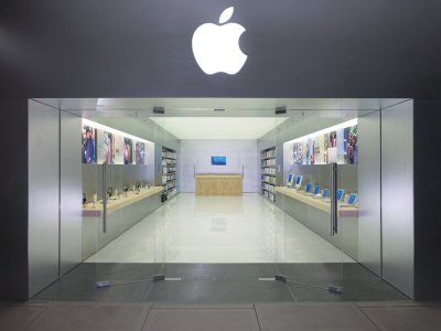
APPLE

The apple with a bite out of it is worldly known as Apple, the computer company’s symbol. The word Apple is not even present on this storefront, but then again is not even needed. Two well-lighted Apple logos frame the entrance. Displays in the windows show off the newest products in a large scale. There may not be much color but it makes a bold statement.
URBAN OUTFITTERS

Urban Outfitters is a very trendy store. By walking by you are able to see how colorful the store is by all the beautiful, bright chandeliers placed everywhere throughout the store. Even the name is well lit so buyers can easily spot the store. The window display is completely open to the rest of the store. I see this a good thing because it allows one to see other products. However, I see it as a bad thing because it takes away from the selected items on display. They blend in with everything else and are not as noticeable.
HARRODS

Harrods of London is large, high-end department store. With enormous windows allows the viewer to see exactly how big the store is. Displays of mannequins and other products sit in the windows with a backdrop of the store. The entrance is set back a few feet from the windows. Framing the entrance are two smaller windows that showcases some of there most expensive jewelry.
EXPENSIVE!

I wonder if it is expensive? Expensive is located in Italy. This store is very symmetrical. Two windows up top with mannequins and two arched below, one being the door. The arches are framed by an architectural detail. The symmetrical look works in their favor I think. It gives a put together, sophisticated kind of appearance which goes with the type of clothing they are selling.
JUICY COUTURE

Couture: the business of designing and making clothes. Juicy Couture created an eye catching window display by creating an actual scene. “Defend your couture” is written large which describes what is the scene is about it. The mannequin with the huge golden gloves knocked out the other mannequin on the floor, hence the black eye. Obviously miss golden gloves was defending her couture or style. I like the display mainly because it is different from most windows. It eye catching and funny!

1 comment:
You've picked an interesting variety of stores to analyze, but I would like to hear more about the ways in which they are the same/differ. Why did you choose the stores you did? What lessons does each store front/window teach you?
I want you to focus even more on your drawings this semester, exploring ways in which color and notes can add emphasis to your ideas.
Post a Comment